
Mobile Websites
In 2014, website searches from mobile phones exceeded those made from PCs. If your website is not mobile-friendly, you are now making it difficult for over 50% of your potential customers to navigate your site.
More importantly, customers may not even be able to find your website if it is not mobile-friendly. Google recently announced that:
“… to make it easier for people to find the information that they’re looking for, we’re adding a “mobile-friendly” label to our mobile search results.
… We are also experimenting with using the mobile-friendly criteria as a ranking signal.”
In other words, Google will soon be displaying mobile-friendly websites higher than those that are not mobile-friendly.
Let Community Communications create a mobile-friendly website to complement your existing PC site. Here’s how it works:
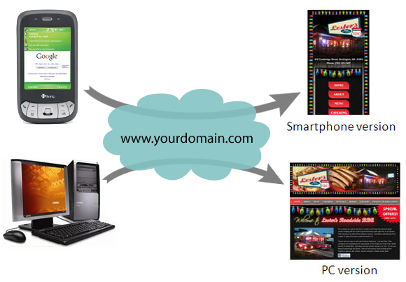
A mobile phone user who goes to your website will automatically be redirected to a mobile-friendly version of your site. A PC user, on the other hand, will continue to see the traditional version of your site.
Below is an example of what a mobile-friendly website looks like.
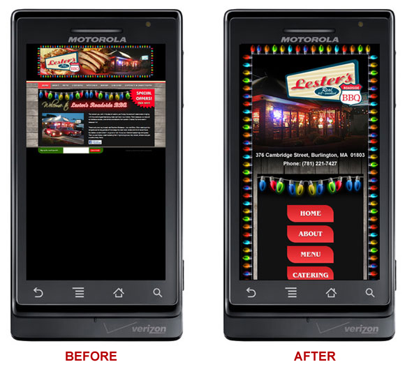
The “Before” image on the left shows how the Lester’s BBQ website used to look on a mobile phone. As you can see, the website was tiny, making it impractical to navigate and get information from. The “After” image on the right shows how the Lester’s BBQ website currently looks on a mobile phone. Users can now easily browse the site and find the information they are looking for.
Give this a try yourself. From your PC, go to www.lestersbbq.com. Then, go to this same site from your phone. While you’re at it, try the same exercise with your own website. See the difference?
Don’t miss out of over 50% of your potential customers! Now is the time to make sure your website is mobile-friendly. Please let us know if you would like more information.